Last month I read an article about duotone illustrations and decided to try a version of the technique myself someday. Today was that day.
Duotone uses two colors — usually black and a color such as blue or red — to make an image. It was popular for a while in 20th Century illustration because it cost less than full color printing. Skilled duotone illustrators like Mead Schaeffer produced visually arresting images.
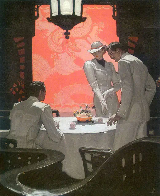
illustration by Mead Schaeffer via Muddy Colors
I wanted to manually create duotone images in sketch apps like [Procreate](https://procreate.com). Time to describe what I came up with.This post isn’t a tutorial, but the information may be useful to you. For that matter it may be useful to me. That’s really what this whole site is about, after all: making life easier for future me, and hopefully maybe you too.
I had a couple of self-imposed limitations while making this. I deliberately chose to only use flat color for this experiment — no shading to speak of. I also used a smaller canvas than usual. It wasn’t a technical limitation, but it did limit the detail I could put into the image.
In retrospect, that’s probably a good thing for this experiment. I ended up with about 50 layers the way I put things together, and this might have slowed my iPad down with a large image.
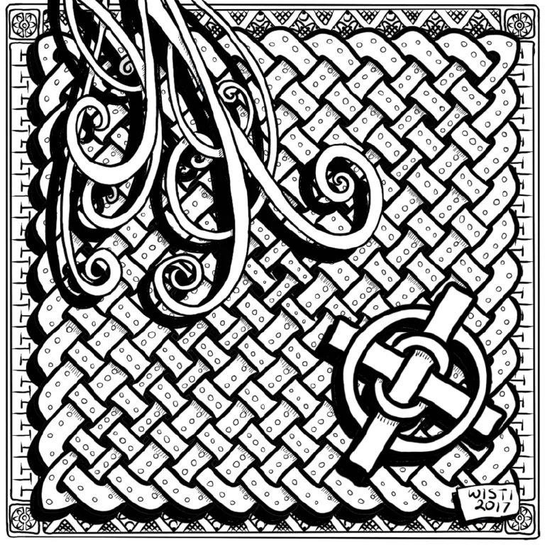
Linework
The first finished step is a solid black and white image. It started out as a Celtic Art knotwork panel demonstration, but somewhere along the way I decided the panel needed extras. Most of those extras came from Tangles of Kells, a collection of Celtic-themed Zentangle patterns.
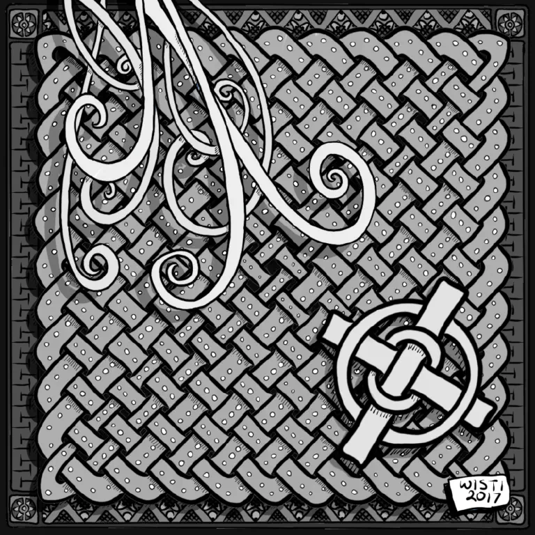
Values
Then I put the values in, working from a grayscale palette. Nothing fancy going on here. The background is darker, the foreground is lighter, with a couple small variations along the way.
I set the drop shadow layers to “Soft Light” so they wouldn’t obscure whatever was beneath them.
Color
For color, I created a new layer under the value layers, which I set to “Multiply.”
Here’s what that looked like, with everything else but linework cut out.
I had an initial stage where all the shadows were hatched lines. Duotone didn’t occur to me until near the end of linework. I’ll try value-based shading for everything in some future sketches.
In order to have value mix nicely with color, I put each color layer beneath its value layer and set the value layer’s mode to “Multiply.”
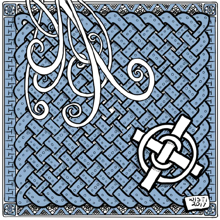
Final
And that’s how I ended up with the post’s cover image.
What now?
That was fun.
I want to explore duotone more, trying some specific ideas.
- shading instead of value blocks
- use higher contrasting values.; this ended up just a tiny bit muddy to my eyes
- multiple color layers — tritone?
- mixing grayscale values and color values in a style more similar to the duotone illustrations I like so much